Find Your Perfect Shade of Pink With Your Color Palette Cards

The Color Palette Cards are a fun and easy way to decide if the color of a clothing item is in your ideal color palette. As you shop and edit your wardrobe, hold up your cards and see if the color fits into the family of colors on the color palette. Is the color too cool or too warm next to your cards? Is the color too soft or too bright?
Here's a tip, if you can't tell, then the color will likely be ok on you. Don't look for exact matches because that will drive you crazy. You're looking for colors that you might want to avoid. The color palette cards are super helpful with this.
Below, I've posted lots of examples on how to identify if a shade of pink is right for your coloring. You'll notice that many pinks span multiple color types. Just because a shade of pink looks good on someone that is cool doesn't mean it can't also be found in the warm color palettes.
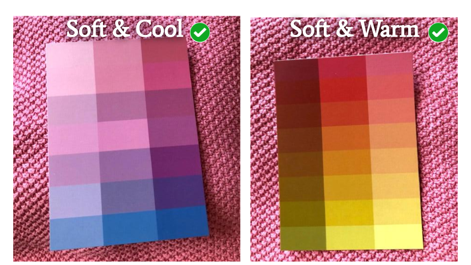
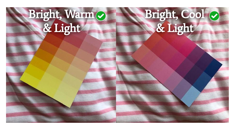
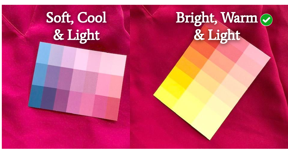
Soft Pink Sweater
This pink sweater is light. It's not super bright or soft. Holding up the Bright and Warm cards... the bright, warm and light card looks best. The card on the left is Bright, Warm and Medium and is looking too strong. This means that this sweater will not flatter someone who is Bright, Warm and Medium. It will look best on someone that is Bright Warm & Light.

Next, I tried the soft and cool cards against this pink sweater. It works. The fact that the sweater is light, allows for people with softer tones to wear it. The sweater's pink hue is pretty neutral. Not really warm and not too cool. So, anyone that is light can wear this sweater.

When a color is light, it is also a little soft. A color doesn't have to have "grey" in it to be soft. As you can see, the soft and warm cards look at home with this sweater too. It's almost a perfect match to the pink in the upper right corner of the Soft, Warm and Medium card.
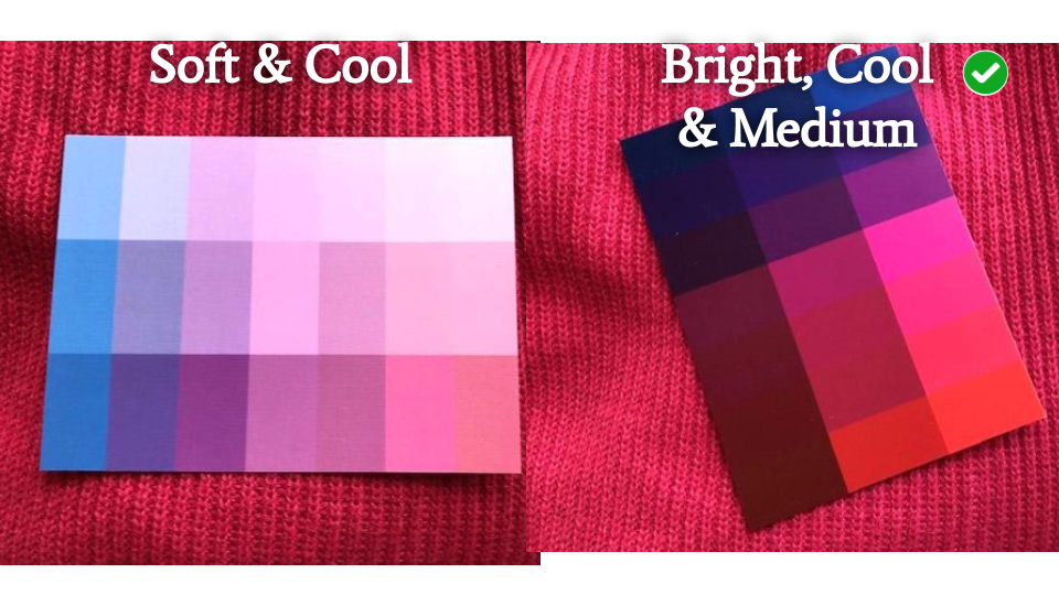
Bright Cool Pink Linen Blouse
This is a pink linen blouse that is in my wardrobe. I used to wear it all the time. I didn't get a ton of complements wearing it but I thought it looked good. I have been humbled by my own color palette cards. This blouse is cool, not warm. It really should be worn by someone who is bright and cool. Notice how "hot" the bright and warm card looks against it. The pink almost has a blue cast to it. I never saw this before. Wow. Look how at home the bright and cool card looks!

This is definitely a bright shirt. I held up the soft cards to show you what that would look like. The soft and warm doesn't work because the shirt is cool. The soft and cool doesn't work because the card looks very grey next to the bright shirt.

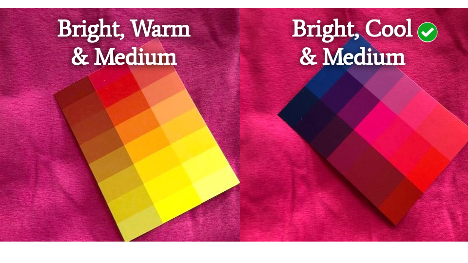
Watermelon Pink Sweater
This sweater is bright and medium. It's a shade of pink-red. Pink with red. Which means it's a shade of pink that both cool and warm can wear. The photos really show it more red than pink but it's how the cards look against it that matter. Notice how the light card pops right off of it? This color is a little too strong for someone who is very fair. The bright, warm and medium card looks right at home.

The soft and cool card is too soft and doesn't blend in at all. This sweater is a bright pink. The bright cool and medium card looks right at home too.
Light Pink Tee
This light pink t-shirt spans multiple color types. It is a bright pink with white added. The white softens the pink a bit allowing people who are soft to wear this color. Notice how the soft, cool and medium card looks in harmony with this light pink top. The soft, warm and medium card looks a little strong against it. The t-shirt may be a little too light for soft, warm and medium.

The soft, warm and light card looks more in harmony than the medium card did. This pink is light and you'll notice that the stronger colors of the warm cards overpower this shade of pink.

This is worth noting. The Bright, Cool and Deep card definitely overpowers this top. However, you want high contrast styles if you are bright, cool and deep. If a light color creates high contrast with your card, then it is also a good fit. The light pink will create high contrast against your dark hair or dark skin. You can also combine this light pink top with a dark jacket or pants to create high contrast.

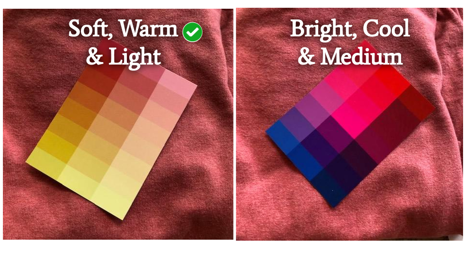
Soft Warm Pink Top
In the store, this top looked dusty pink. I thought, "This is perfect for a soft and cool!". I brought it home... and put the color palette cards against it and discovered that it is a warm pink! The lights in stores really mess you up. I didn't have my cards with me when I went shopping, so I just depended on my eye. But I was wrong.
You can see how this fabric has a blend of pink and maybe greys. It's not a solid pink. This is a good indicator that a top is "soft". On the left is the soft, warm and light card. Perfect. This also works pretty well with bright, warm and light. If you're warm and fair you can wear these softer colors. They may not be the BEST but you can definitely wear them if you like the color.

Here's the soft, warm and medium card against this top. The top is light and these colors don't seem to be in harmony with the top. It may wash you out if you're medium to deep.
Notice how warm this fabric looks against the soft and cool card. I had tried this card first, confident this top was cool and dusty. I was completely wrong. The bright and warm card is too bright and strong.

Striped Pink and White Top
The combination of white and light pink make this a good top for most light individuals. The low contrast also conveys a somewhat soft pattern. The thin light pink is good for soft and cools, and, really, all lights. The soft, cool and light card looks in harmony with the shirt. The pink does seem a little brighter in the top, but I think this still works.

The light pink stripe is a perfect fit for bright and lights. The white is more ideal for cool, but this can be worn by warm too. You can't get away from white in the warm weather. This white top with pink is a better choice than just a plain white top... on bright and warms.
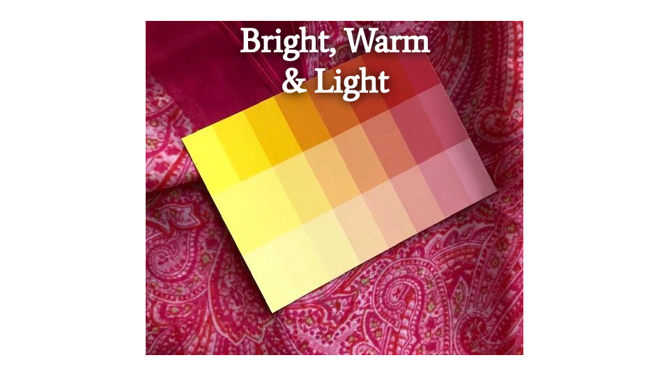
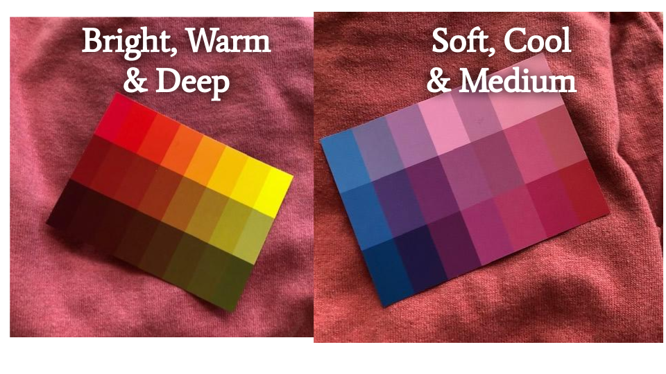
Bright Pink Paisley Shawl
This is a bright paisley patterned shawl. In the store, I thought it was perfect for bright and warm. But it's really better for bright and cool. I put both cards of the bright, cool and deep set on this pattern because it has some bright yellow in it. All the colors are in harmony with one another. Perfect. On the right is a soft and cool card. This top is bright not soft.

The bright warm and deep card doesn't look too bad against this pattern. It's not as successful as the bright and cool cards. The pink is more magenta than red.

I'm bright warm and light and I really wanted this top to work for me. The colors in this print are really vibrant and I don't think it's going to flatter me very much. I still love it and might try to make it work. It's how I feel in it that matters the most.
Bright Magenta Pink Top
This is a simple tank top I found in bright magenta. You can see how this color has a blue tint to it when compared to the bright, warm and medium card. The bright, cool and medium card is blends in perfectly with this magenta top.
The softer colors won't work either. This is a strong bold color and not ideal for soft and cools nor for warm and lights.
All bright and cools can wear this bright magenta. All three cards look perfect against this top.

Bright Watermelon Pink Top
This is a top you see me in regularly. The photo on the right is a pretty accurate shot of the color. It's a red-pink. Which means that it can be worn by both warm and cool. Honestly, I love this color. I think it looks good on me. But I do see, now, that it is a little cooler than I realized. Still, when you see the bright, warm and light color palette card against it, it works. Notice the top is bright and the soft and cool card looks out of place.
I didn't put a green check mark on the left, but this top will look good on all brights.

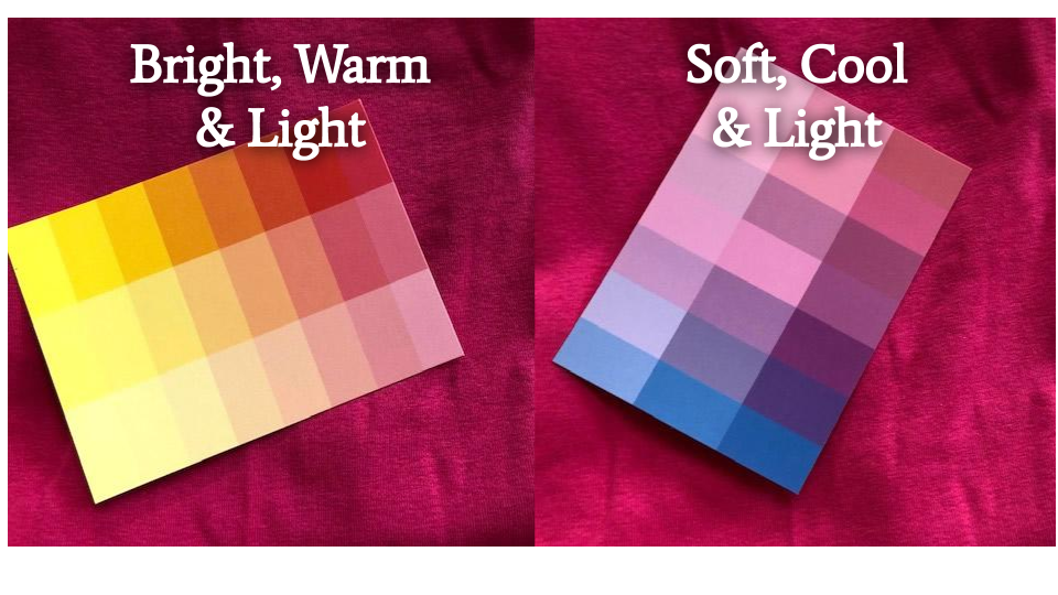
Soft Warm Pink Sweater
This pink sweater looks like it has yellow in it when compared to a cool pink. It is also soft. It has this muted quality to it. It's not bright. The soft, warm and light card blends in perfectly. Notice how warm the sweater looks next to the bright and cool card.
Both of the cards shown below don't work. The bright and warm is too strong. The soft and cool is too cool.
I am bright warm and light. This sweater is in my closet. I never wear it because I don't like it on me. It's probably because it's a pink that flatters soft and warm best. It isn't bad, as you can see with the bright, warm and light card. It's just not great.

I hope this was helpful. As you can see, the color palette cards are a guide. They may give you a perfect match to a color, but often they may just be close enough. If you love the color and it seems to be in the family of colors on your color palette cards, then that's good enough. Try not to get hung up on being precise. There is an infinite amount of shades and tints of each color. It is impossible to capture every single variation made by all the different clothing manufacturers. The more you use the cards, the more you will train your eye to recognize colors that will flatter you.
Welcome
New to Your Color Style?
Transforming your style is easy.