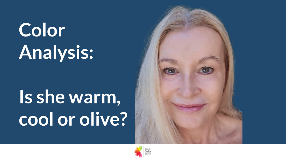
Color Analysis Case Study: A Unique Pale Olive Skin Tone That Tested All the Rules
Every week, I analyze women whose coloring is easy to identify… and women whose coloring is wonderfully complex.
This case study falls into the second category — and it’s a perfect example of why a Signature Color Analysis is so important when your undertones don’t behave the way you expect.
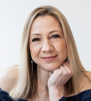
This client has:
-
Cool blue-gray eyes
-
Naturally cool medium brown eyebrows
-
Dyed platinum hair (which can mislead the eye)
-
A yellowish cast to the skin — but not golden
-
Slight olive influence without full olive undertones
At first glance, you might assume she’s warm.
You might even assume she’s light.
But the drapes tell a very different story.
Let’s break it down.
⭐ Step 1: Determining Her Depth — Light, Medium, or Deep?
Even though she currently colors her hair platinum, her natural hair color is closer to a cool medium brown.
When we evaluate coloring, we always consider:
-
Natural coloring
-
The depth needed to support the face
-
Whether lighter palettes wash the skin out
Light palettes (whether light warm, light cool, or light olive) felt too airy and did not give her the presence she needs.
Therefore, she fits best in the Medium depth category.
⭐ Step 2: Warm or Cool Undertones?
This is where things got interesting.
❌ The warm drapes brought out yellow under her eyes.
Even warm red — normally a reliable test drape — emphasized the yellow in a way that felt unbalanced and not harmonious.
❌ The golden yellow and warm red together made her look uneven.
Warm undertones should glow in warm colors.
She did not.
I tested:
-
Golden yellow
-
Warm red
-
Warm peach red
-
Warm lip colors
All of them emphasized the surface yellow in her skin in a way that was not flattering.
✔ The cool drapes evened her complexion instantly.
When I placed a cool red next to the same warm red, her entire face looked more even, more lifted, and more bright-eyed.
This confirmed:
👉 She is NOT warm.
👉 She is on the cool side of the color wheel.
⭐ Step 3: Testing Green — The Olive Skin Tone Clue
Because she has a yellowish cast, I tested green (a major olive indicator).
✔ A clear green looked “okay”
But not great.
✔ A softened gray-green looked perfect
This was the moment everything clicked.
Bright greens were too sharp.
Muted, gray-green tones felt balanced and harmonious.
This told me two things:
-
She has some olive influence but not dominant olive undertones.
-
She is soft, not bright.
⭐ Final Result: Soft Cool Medium
Once I draped her in the Soft Cool Medium palette, the harmony was undeniable.
She looked stunning in:
-
Soft rose pink
-
Muted cool red
-
Gray-blue
-
Soft blue-green (spearmint vs kelly)
-
Soft gray-green
-
Muted cool purples
What she should avoid:
-
Olive green
-
Warm yellows
-
Bright greens
-
True warm reds
-
Bright warm chroma colors
These tones pull out too much yellow or green from her skin and disrupt the harmony.
⭐ Why This Case Study Matters
If you're someone who:
-
Has some surface yellow but isn’t warm
-
Has pale or subtle olive influence
-
Has cool eyes but doesn’t fit into bright cool
-
Dyes your hair and feel “misplaced” in palettes
-
Looks washed out in light colors
-
Looks sallow in warm colors
…then Soft Cool Medium may be your perfect home.
💗 Get Your Custom Color Palette
If your coloring feels confusing or tricky, that’s exactly what the Signature Color Analysis is designed for.
We customize your palette based on:
-
Undertone
-
Depth
-
Chroma
-
Olive influence
-
Hair color (natural + current)
-
Eye patterns
-
Surface tones
Get a Signature Color Analysis