Can I Wear Bright Colors Over 40? Yes—And Here’s How to Do It Beautifully
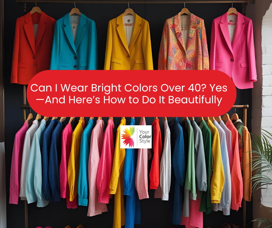
Can I Wear Bright Colors Over 40? Yes—And Here’s How to Do It Beautifully
If you’ve ever stood in front of a bold coral dress or a vibrant blue blouse and thought, “Can I really pull this off at my age?”—you’re not alone.
But here’s the truth:
You don’t age out of color. You evolve into the colors that bring you to life.
In this article, we’ll debunk the myth that bright colors are “too much” after 40, explain what “bright” actually means in color theory, and show you how to wear bold, flattering hues that match your personality and style.
So if you’ve been Googling bright colors for women over 40 or wondering how to wear them without feeling overdone—this one’s for you.
What Does "Bright" Really Mean in Color Theory?
Bright doesn’t mean neon or highlighter-yellow. In color theory, bright means high chroma—pure, vivid colors that are clear and free from gray undertones.
These colors are:
-
Crisp
-
Clear
-
Energizing
Examples:
-
Fuchsia instead of mauve
-
Cobalt instead of navy
-
Apple green instead of olive
-
Turquoise instead of dusty teal
Bright colors give your features a boost. The right bright can make your skin look radiant and your eyes pop. It’s not about being loud—it’s about being alive in your coloring.
Bold vs. Bright: What's the Difference?
It’s easy to confuse the two—but bold and bright are not the same thing.
-
Bright refers to a color’s chroma—how clear and vivid it is.
-
Bold refers to visual impact—a bold look might include high contrast, strong shapes, or deeply saturated colors.
You can absolutely wear bold colors without wearing bright ones.
Examples:
-
Deep burgundy is bold but not bright.
-
Emerald and navy make a bold statement without high chroma.
-
Charcoal and icy pink create strong contrast in a subtle way.
This is especially helpful if you’re a Soft type or someone who feels overwhelmed by too much intensity. Boldness can be achieved through styling, not just color saturation.
Why Bright Colors Work So Well in Midlife
As we age, our natural features soften. Hair may gray or lighten, brows fade, and skin can lose contrast or vibrancy.
This is where bright and saturated colors become powerful tools. They:
-
Lift the face
-
Bring out the eyes
-
Counteract dullness or sallowness
-
Reflect your energy and personality
The key is knowing which bright—or saturated—colors work for you. Not all brights are flattering to all complexions, but the right one can transform your look instantly.
Finding the Right Bright Colors for You
Not all bright colors are created equal—and not all of them are meant for you. The key to wearing color confidently in midlife is knowing which hues enhance your natural coloring rather than compete with it.
It all comes down to your:
-
Undertones (warm vs cool)
-
Chroma (bright vs soft)
-
Contrast level (high or low)
-
Depth (light, medium, or deep)
Knowing your color type makes a world of difference. Here’s how to begin understanding your best brights and alternatives:
🌞 Bright & Warm Types
Examples: Bright Warm Light, Bright Warm Medium
You likely have golden, peachy, or warm undertones with clear skin and bright eyes. Your coloring thrives in clear, warm, and energetic shades.
Best brights include:
-
Coral
-
Golden yellow
-
Aqua blue
-
Bright peach
-
Tomato red
-
Warm lime green
These hues light up your features and harmonize with your natural warmth and clarity.
❄️ Bright & Cool Types
Examples: Bright Cool Deep, Bright Cool Medium
You may have high contrast between your hair, skin, and eyes—like dark hair and fair skin, or olive skin with bright eyes. You shine in cool, high-chroma colors.
Best brights include:
-
Fuchsia
-
Cobalt blue
-
Cherry red
-
Icy teal
-
Magenta
-
Sapphire
These shades create a sharp, stylish presence that aligns with your vivid contrast.
🍁 Soft & Warm Types
Examples: Soft Warm Medium, Soft Warm Deep
You likely have warm undertones with blended, low-contrast features—think hazel eyes, golden brown hair, and warm skin tones.
You may not need high-chroma brightness, but instead crave depth and richness in your color. Look for soft, warm, and saturated tones with golden undertones.
Try:
-
Soft coral or terracotta
-
Muted mustard or goldenrod
-
Sage green or olive
-
Dusty turquoise or warm teal
-
Rust or coppery red
-
Muted watermelon
If brights feel too harsh, go deeper and warmer. Think colorful, not loud.
🌸 Soft & Cool Types
Examples: Soft Cool Medium, Soft Cool Deep
You may have cool undertones with gentle contrast—like ash brown or gray hair and soft blue or green eyes.
Your ideal colors are often cool, subtle, and slightly muted—not gray, but also not blindingly bright. You may look better in saturated tones with softness and depth, rather than high-chroma brights.
Try:
-
Rose pink
-
Plum or soft violet
-
Cranberry red
-
Cool teal
-
Misty blue or gray-blue
-
Periwinkle
If you're unsure, avoid ultra-bright shades and lean into refined, moody cool tones.
😌 Not Ready to Go All In? Try This
If you’re still building color confidence, you don’t need to dive headfirst into bold brights.
Start here:
-
Add a pop of color with a handbag, shoes, or scarf.
-
Use brights in prints—floral, abstract, or geometric patterns are a gentle way to incorporate them.
-
Try bottoms or accessories in brighter shades if you're hesitant to wear them near your face.
Remember, color doesn’t have to shout—it can whisper. Even the smallest splash of the right hue can lift your look and your mood.
🔍 How to Test Brights on Yourself
Here’s a quick test you can do at home:
-
Stand near a window in natural daylight.
-
Hold up various bright or saturated colors next to your face (use scarves, tops, even fabric swatches).
-
The right shades will make your eyes sparkle and your skin look even and fresh. Ask, "do I notice me or the garment?"
-
The wrong ones may enhance under-eye circles, redness, or make you appear washed out.
Still not sure? This is where professional guidance makes all the difference.
✨ Why a Professional Color Analysis Makes All the Difference
A trained color analyst evaluates far more than just your skin tone. At Your Color Style, we consider:
-
Your undertones (warm, cool, or neutral)
-
Your contrast level (high, medium, low)
-
Your chroma (bright vs soft)
-
Your depth (light, medium, deep)
We then provide a custom color palette that reflects your unique coloring and lifestyle, plus guidance on how to use it with confidence. No guessing, no trial and error—just clarity and ease.
Bright Colors Aren’t Just Fashion—They’re Energy
Wearing the right colors isn’t about trends. It’s about expression and connection—between how you look and how you feel.
Color is a visual language that says:
-
I’m here.
-
I know who I am.
-
I’m not fading into the background.
So yes, you can wear bright colors over 40.
In fact, it might be the best time to start.
Ready to Find Your Brightest Colors?
At Your Color Style, we specialize in helping women in midlife discover the exact shades that flatter their features—and feel like them.
🎯 Start here: Watch the Free 3-Step Color Analysis Workshop
✨ Ready to transform? Get Your Signature Color Analysis
Frequently Asked Questions
Q: What are the best bright colors for women over 40?
A: The best brights depend on your undertones and contrast. Warm types may glow in coral, aqua, and golden yellow, while cool types shine in cobalt, fuchsia, and icy teal. Soft types may prefer muted or deep versions for a more refined effect.
Q: Can I wear bright colors with gray hair?
A: Yes! In fact, gray hair often looks best with clean, high-contrast brights like turquoise, cherry red, or magenta. These shades bring energy and definition to softened features. Golden tones may not work best if your hair is on the silver side.
Q: How do I know if a bright color flatters me?
A: A flattering bright will make your skin look fresh and your eyes more defined. If a color makes you appear tired or emphasizes lines or redness, it may be too harsh or wrong in undertone. Ask, "am I wearing the color or is it wearing me?"
Q: What if I prefer deeper or more subtle colors?
A: You don’t have to wear high-brightness hues to have impact. Many women over 40 look stunning in deep, bold, or saturated colors that offer richness without intensity. Bold doesn’t always mean bright.


- Posted in bold colors, bright colors, bright colors for women over 40, color analysis, color theory for mature women, flattering colors, how to wear color over 40, midlife fashion, personal color palette, women over 40 style