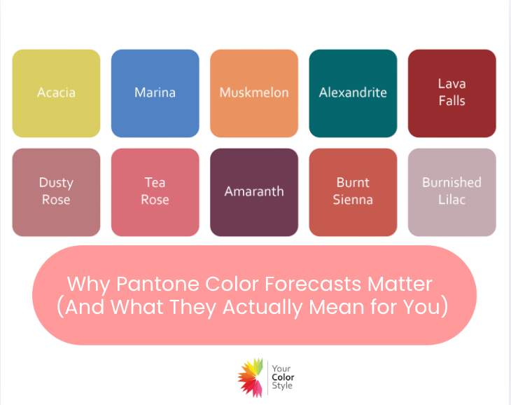
Every season, the Pantone Fashion Color Trend Report — released alongside events like New York Fashion Week — outlines the colors designers will feature in upcoming collections.

And shortly after, most of those colors begin appearing everywhere.
In stores.
In makeup counters.
In accessories.
In home décor.
So yes — Pantone forecasts matter.
But not for the reason most people think.
They Influence Availability, Not Flattery
Pantone doesn’t decide what looks good on you.
They help shape what becomes widely available.
If the forecast leans toward saturated corals and energetic greens, retailers stock those shades. If the direction shifts to softer, earthy neutrals, that’s what fills the racks.
Understanding this prevents confusion.
When a store feels “very bright” or “very muted” one season, it’s not random. It’s part of a larger design cycle.
But here’s the key distinction:
Availability and harmony are two different things.
Every Color Is Not for Every Person
A trending color is simply a direction in fashion — not a universal solution.
An electric yellow may look vibrant and clear on someone with bright, warm coloring. On someone softer or cooler, that same yellow may feel overpowering.
A deep moss green can look rich and balanced on olive skin. On someone who needs clarity and brightness, it may appear heavy.
An icy lavender may glow on a high-contrast cool woman and wash out someone warmer.
When women try a trend color and feel “off,” they often assume something is wrong with them.
In reality, the color simply didn’t align with their depth, undertone, or chroma.
Want to know your best colors? Our Signature Color Analysis is an in depth look at the colors that will make you shine.
Trends Reflect Mood
Color forecasts also mirror cultural psychology.
-
Bright, high-energy tones often signal optimism or boldness.
-
Earthier tones suggest grounding and stability.
-
Soft pastels reflect comfort or calm.
-
Jewel tones convey confidence and strength.
These themes tell us something about the broader design mood of the moment. They don’t override individual coloring.
How We Approach Trend Colors at Your Color Style
At Your Color Style, we view trend colors through the lens of color theory.
Inside our Style Masters membership, when we discuss seasonal reports, we focus on:
-
Where the color sits on the spectrum
-
Whether it leans warm or cool
-
Whether it is clear or softened with gray
-
Its depth level (light, medium, deep)
-
Which color types it harmonizes with
Most importantly, we show how to adjust:
-
Wear it near your face or away from it
-
Choose a clearer or softer version
-
Select a lighter or deeper interpretation
-
Balance it based on your contrast level
The conversation is never “Everyone should wear this.”
It’s “Who does this naturally support — and who should adapt it?”
Want to explore the Spring trending colors and which ones are for you? Join STYLEMASTERS today!
The Bigger Perspective
Pantone forecasts help explain what you’re seeing in stores.
Your personal color harmony explains what works for you.
And here’s an important reality:
Because fashion moves in cycles, there will be seasons when your very best colors simply aren’t widely available.
If your ideal shades are soft and muted during a high-saturation year, you may struggle to find them. If you thrive in clear, vibrant color during a muted, earthy cycle, the racks may feel dull.
That doesn’t mean your palette changed.
It means the marketplace shifted.
This is why, when you do see your best colors available — especially in well-made, versatile pieces — it’s wise to purchase them. Trend cycles rotate. A color that floods stores this year may disappear for several seasons.
Understanding this helps you shop strategically rather than emotionally.
Pantone forecasts tell you what’s coming.
Your color harmony tells you what to keep, what to adapt, and when to invest.
Color is powerful.
But it’s most powerful when it aligns with you — not just the season.
Gail Scott is the Style & Beauty Director for Your Color Style. She specializes in helping women save time and gain confidence by curating a closet that makes getting dressed effortless. With over 30 years of makeup experience, she creates head-to-toe looks that feel authentic, polished, and completely aligned with who you are today. If you’d like to talk more about your style or colors, book a complimentary 15-minute call with Gail here: https://forms.gle/bzKojd8GKZv2RTwV9