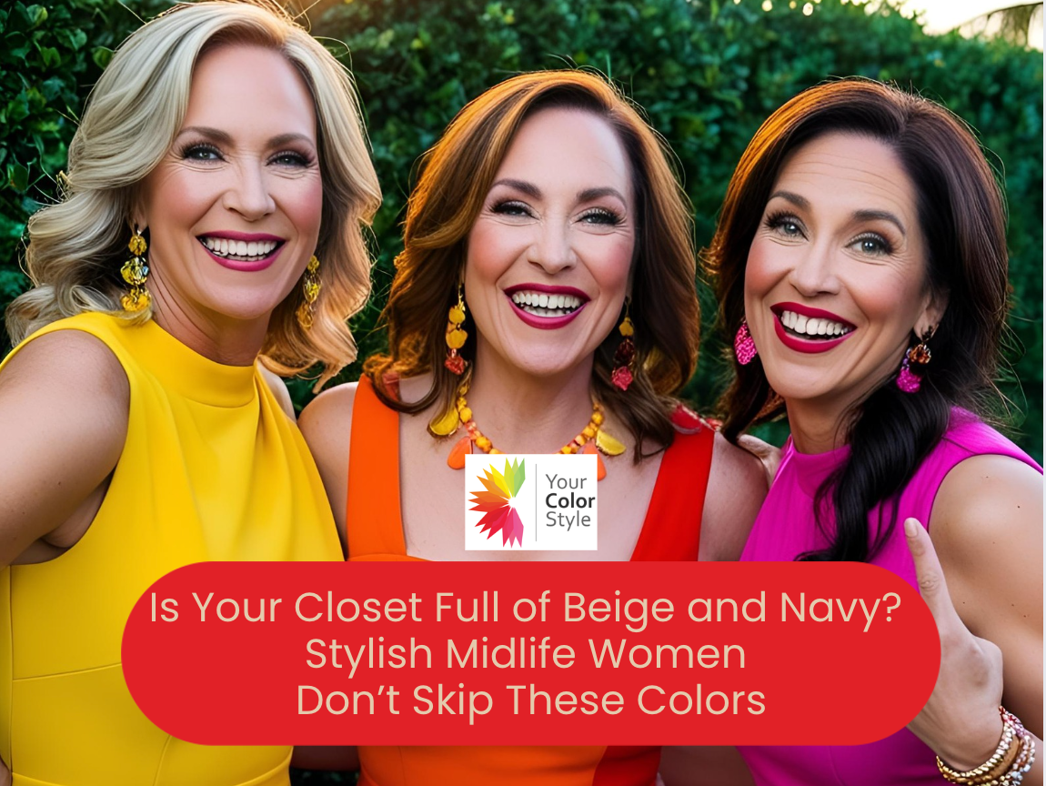
Stylish Midlife Women Don’t Skip These Colors
If you're in your 40s, 50s, or 60s, your personal style should reflect the confidence, success, and individuality you’ve worked hard to earn. But here's the truth: many midlife women unknowingly skip the very colors that could transform their look—and their confidence.
Why?
Because somewhere along the way, they were told these colors were too bold, too bright, too youthful, or just "not for them." Years of playing it safe in black, beige, or navy has created a style rut—and it’s holding you back from looking (and feeling) your best.
But the most stylish, empowered midlife women are doing the opposite. They’re choosing colors that highlight their features, elevate their image, and support the lifestyle they’ve built.
So if you’ve been hiding in beige and navy… it’s time to step into your boldness.
Let’s break down the must-wear colors every midlife professional woman should consider—and the common mindset traps that might be keeping you from wearing them.
1. Red – The Color of Power, Passion, and Presence
🛑 Why Women Skip It:
Red can feel “too loud,” “too sexy,” or “too young.” Many women worry it attracts unwanted attention or feels too aggressive for professional settings.
✅ Why You Should Embrace It:
Red—when chosen in the right tone—enhances your skin tone, energizes your look, and projects bold confidence and leadership. It’s not just for special occasions; it’s your new power move.
🟥 Best Reds to Try:
-
Cranberry, ruby, or cherry for cool undertones
-
Tomato red, brick, or chili for warm undertones
-
Dusty reds or wine tones for soft chroma types
2. Yellow – A Style-Forward Choice for the Bold and Bright
🛑 Why Women Skip It:
Many believe yellow is hard to wear or unflattering. Others think it’s “too playful” or worry it clashes with graying hair or changing skin tone.
✅ Why You Should Embrace It:
Yellow is an instant mood-lifter that adds warmth, energy, and style. There’s a yellow for every skin tone—when you find yours, it can completely brighten your appearance.
💛 Best Yellows to Explore:
-
Lemon or butter yellow for cool undertones
-
Mustard, marigold, or sunflower for warm undertones
-
Soft gold or flaxen yellow for neutral and olive undertones
3. Orange – The Most Underrated Confidence Color
🛑 Why Women Skip It:
Orange is often viewed as “too bold,” “too trendy,” or not appropriate for professional wear. Many associate it with fall holidays or sports teams—not chic wardrobes.
✅ Why You Should Embrace It:
In the right tone, orange is warm, approachable, and full of vitality. It makes you stand out in the best way—especially in speaking engagements or leadership roles.
🧡 Smart Shades of Orange:
-
Coral, salmon, and melon for cool or neutral undertones
-
Rust, terracotta, and pumpkin for warm undertones
-
Earthy tones like copper or sienna for deeper skin or hair contrast
4. Pink – Powerful, Not Precious
🛑 Why Women Skip It:
Pink is often dismissed as childish, overly feminine, or not serious enough—especially in executive or leadership environments. Some women fear it makes them look “soft.”
✅ Why You Should Embrace It:
The right pink flatters aging skin, softens your features, and adds warmth and polish. Pink can be powerful, elegant, and commanding when styled intentionally.
🌸 Flattering Pinks to Consider:
-
Blush, mauve, and dusty rose for cool undertones
-
Desert rose, coral-pink, and warm rose for warm undertones
-
Neutral tones like shell pink or nude-pink for versatility
💬 Style Reminder: Pink isn’t juvenile—it’s strategic. Stop hiding in navy and wear the color that softens your presence while keeping your style elevated.
5. Brown – The Rich Neutral That Outranks Black
🛑 Why Women Skip It:
Brown is often overlooked as dull or too casual. Many women default to black or navy thinking it’s more polished or slimming—especially for workwear or formal events.
✅ Why You Should Embrace It:
Brown is softer and more flattering than black for most women over 40. It brings warmth, sophistication, and versatility—and makes other colors in your wardrobe shine.
🤎 Try These Browns:
-
Espresso or dark chocolate for dramatic contrast
-
Camel, cinnamon, or toffee for warm undertones
-
Cool-toned browns like taupe or mink for cool complexions
👜 Pro Styling Tip: Pair brown with mustard, teal, or rose for luxe, grown-up style that stands out—no navy needed.
Want to Know Your Best Colors?
Not all reds, pinks, or browns are created equal. That’s why our Signature Color Analysis goes beyond seasonal categories to help you discover the colors that truly flatter you based on undertone, depth, and chroma.
📩 You'll receive:
-
A personalized ebook with your photo draped in your best colors
-
20+ recommended shades
-
An expanded digital color palette
-
A mini color fan and color guide
-
One month of access to our Style Masters community
Final Thought: Stop Hiding in Beige and Navy—Start Showing Up in Style
Your wardrobe should reflect your brilliance—not camouflage it. The most stylish midlife women aren’t skipping bold colors—they’re choosing them with intention, clarity, and confidence.
So the next time you reach for “safe,” pause and ask:
What would the confident version of me wear today?
The answer? Color that makes you feel as radiant and powerful as you truly are.


- Posted in bold colors for women, color analysis, color for confidence, colors for women over 40, colors to wear instead of black, elevate your style, fashion over 50, flattering colors, how to wear color, midlife style, professional image for women, stop wearing beige, style tips for midlife women, wardrobe confidence