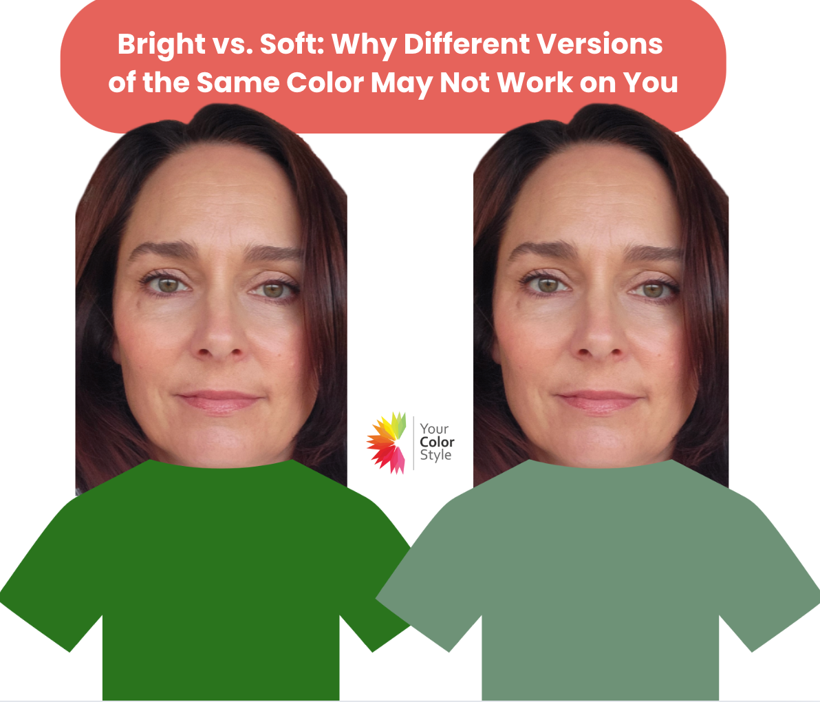
Bright vs. Soft: Why Different Versions of the Same Color May Not Work on You
🎨 What Is Chroma in Color Analysis?
Chroma refers to the clarity or softness of a color, and it plays a major role in how a color interacts with your natural features.
-
Bright chroma = vivid, clear, pure, and energetic.
-
Soft chroma = muted, dusty, “dirty,” or less clear.
You can have two versions of the same color—say, a bright turquoise and a soft seafoam—and one might make you look radiant while the other makes you look tired.
⚠️ Don’t Confuse Soft with Light or Unsaturated
Soft doesn’t mean pale or washed out. Soft colors can be medium or even deep, but they have a muted, blended quality. They're often softened with another color—like gray, beige, brown, black, or white.
Likewise, bright colors aren't always neon—they’re simply clean and high in clarity.

While our bright, warm, medium model is beautiful in both shades, notice that the bright, clear chroma green lights her up, while the softer, muted green makes her look a little less alive. The only difference in these photos is the shades of green. In the brighter shade her skin looks clearer and her eyes appear brighter, even though her makeup and lighting are the exact same. This is why finding the right shade of any color makes a huge difference in how you look. It also explains why people often think they cannot wear a certain color...it's often because they didn't try it in the right chroma and/or depth. Imagine how this knowledge opens up a world of color possibilities!
✨ Bright Chroma: What It Means and Who It Flatters
People with bright chroma usually have higher contrast in their features—for example, dark hair with light eyes, or vivid coloring overall.
✅ When you wear bright colors:
-
Your skin looks clearer
-
Your eyes pop
-
You appear more energized and awake
Bright chroma colors include shades like:
-
Clear red
-
Bright cobalt blue
-
True hot pink
-
Lemon yellow
These clean, pure shades amplify your natural clarity. But soft colors can make you look dull, gray, or lifeless in comparison. If a color is making you look tired or ill, it may be too soft for you.

🌸 Soft Chroma: What It Means and Who It Flatters
If your features seem to blend together—medium hair, soft skin, eyes that don’t contrast much—you may fall into the soft chroma category.
✅ Soft colors are:
-
Muted, dusty, or “dirty”
-
Less clear and more blended
-
Often softened by mixing with gray, beige, brown, black, or white
Think of:
-
Sage green
-
Dusty rose
-
Smoky lavender
-
Taupe
These tones harmonize beautifully with your natural softness.
✅ When you wear soft colors:
-
Your complexion looks smoother
-
Your features look balanced
-
You glow gently and effortlessly
But bright colors might feel too loud, creating harshness or making you appear washed out. If colors feel like they are wearing you, they are probably too bright for you.

🤷♀️ Still Not Sure if You’re Bright or Soft?
You’re not alone. Chroma can be one of the hardest things to figure out on your own.
Many women assume they’re “bright” because they like bold colors—or “soft” because they don’t. But chroma has nothing to do with your personality and everything to do with how color interacts with your natural coloring.
That’s why DIY color quizzes and guesses often fall short.
🧭 Why a Professional Color Analysis Is Worth It
It often take a trained eye to spot differences in chroma and depth. At Your Color Style, our analysis are trained and experienced in identifying your best colors and your color type. We take the guesswork out of finding your best colors with our proven 3-step process that identifies your:
-
Depth – Light, Medium, or Deep
-
Temperature – Warm or Cool
-
Chroma – Bright or Soft
This analysis will also help you to understand WHY you are a certain color type. This 3 step approach gives you answers, not more questions.
Our Signature Color Analysis is done entirely online. You send a photo, and we return a detailed PDF showing you draped in your best colors—plus a personalized digital palette and mini fan so you can shop and dress with total confidence.
👉 Get Your Signature Color Analysis Here
🎁 Bonus: What You’ll Get With Your Analysis
-
Up to 20 signature colors tailored to your features
-
Your best neutrals and accent colors
-
A customized color palette and mini fan
-
A color guide to help you apply it to clothing and makeup
-
1-month trial of our Style Masters community
💬 Final Thought: The Right Chroma Changes Everything
Wearing the right chroma can transform how you look and feel.
You’ll stop questioning every outfit.
You’ll stop wasting money on the wrong clothes.
And you’ll finally feel like your wardrobe reflects you.
It’s not about following rules—it’s about discovering what naturally works.
🎨 Ready to stop guessing and start glowing?
👉 Find Out If You’re Bright or Soft Now


- Posted in best colors to wear, bright vs soft chroma, bright vs soft colors, chroma in color analysis, color analysis, color analysis for women, color draping, color palette analysis, how to find your best colors, muted colors vs clear colors, online color analysis, personal color analysis, soft vs bright color palette, virtual color analysis, what colors flatter me